Introduction
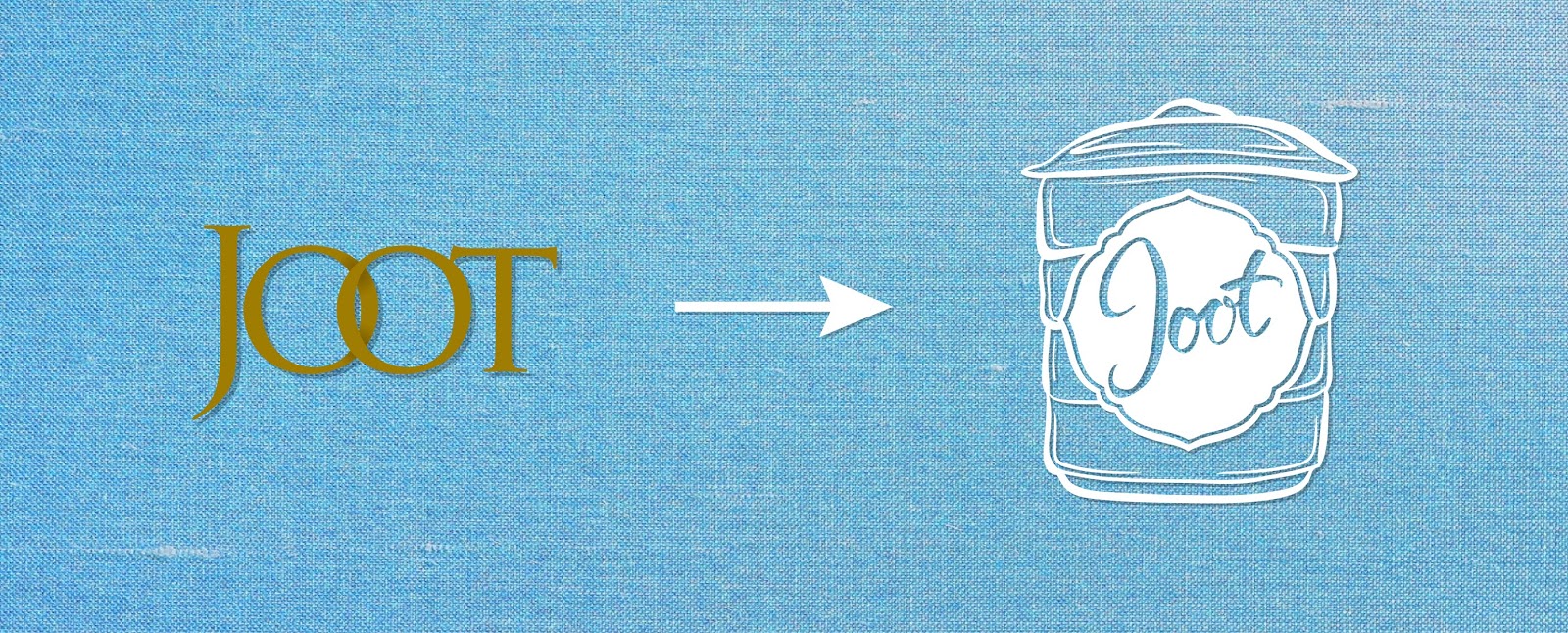
I helped out as a graphic designer for a friend's company called Joot. And got to rebrand their company. Joot is a company that specialises in gifts and products that embraces the Peranakan culture in Singapore. Joot was moving forward into looking into more modern products so they needed to create an identity for themselves.
Logo
It took quite some time for us to think of a concept that worked to embrace the Joot Brand. I studied the peranakan culture and tried collecting elements that linked to how the company works.
One of the ideas I tried includes a phoenix into the logo, in a iconic peranakan 'Kamcheng'.
Eventually the direction focused more on an art with a feature of the flower shape like motif on the centre of a 'tingkat' - another iconic peranakan product.

Because 'Joot's main target customers are Hotels, Tourists & Women. Hence these are 4 characteristics that was identified as the 'Joot' identity.
Colour Palette // Typeface